Project Destination
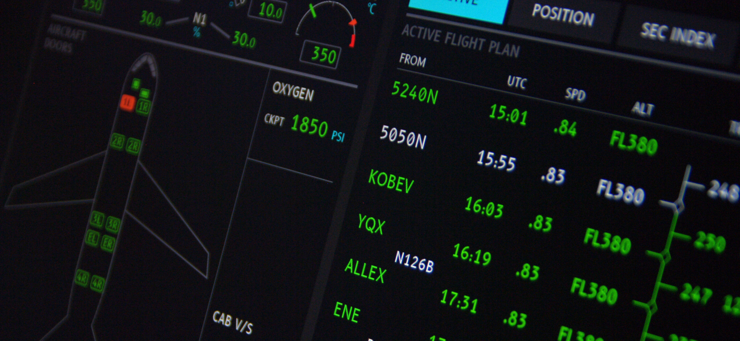
For Airbus, the objective of the project is the provision of a soft- ware component: a digital typeface consisting of a set of variants (vector fonts) for the optimal display of textual information on screens of future Airbus programs. This font will be an integral part of all systems and devices of the aircraft: cockpit displays for CDS systems (avionics), OIS (information), OMS (maintenance), and cabin display screens for the FAP (control panel).
Project members: Laurent Spaggiari (AIRBUS) Jean-Luc Vinot (ENAC) Sylvie Athènes (Université de Toulouse) Yves Rinato (intactile DESIGN)
Font authors: Nicolas Chauveau, Thomas Paillot (intactile DESIGN) Jean-Luc Vinot (ENAC)
Thanks to Jonathan Favre
B612 font design
The Dossier de conception et de spécifications typo- graphiques (Design and typographical specifications document) by J-L VINOT and S ATHÈNES determines the criteria for usability evaluation and design recommendations. These elements define the requirements of the software component requested by Airbus. The design choices made are presented below, with re- gard to usability criteria and recommendations set out during the specification phase.
1. Efficient and easy reading
Ease and efficiency of reading are the first criteria to consider when designing a software component for the display of aeronautical in- formation for critical interfaces. To meet the requirements of target activities, typeface design must ensure discrimination and identifi- cation of its characters.
Identification
In order to ensure clear and rapid identification, the typeface design has respected basic shape characteristics to allow for good visual information on the graphic characteristics unique to each letter. The variations in thickness of each mark retain the natural contrast of each letter. Linear marks (with no thickness contrast), as that of the CDS font (actual cockpits), were excluded.
The general form of the characters – archetype – is also respected and highlighted as much as possible by the accentuation of the ascenders1 and descenders.
In the same way we avoid making the bowls6 rectangular: the legibility of the counterforms is preserved, with a sufficient dimension for the bowls, crossbars and internal angles.
Discrimination
The design of the typeface and the alphanumerical characters aims at maximising the distances between forms to allow for easy, clear identification of each character. The results of experiments done during previous phases on successive versions of the typeface have meant ‘confusion matrices’ could be created (cf. Experimental and Algorithmic evaluation in Laboratory: Final re- port (Évaluation expérimentale et algorithmique en laboratoire : Rapport Final) S ATHÈNES and J-L VINOT).

The shaded areas indicate accentuated and enlarged parts for each character